Alon: COWBOYS
PROJECT TYPE
promotions
TOOLS
illustrator, Photoshop
ROLE
Designer
yEAR
2018
ALON Convenience Stores are quite popular across Texas. They’re part of the ALON Brands network, providing a combination of fuel and retail convenience services. These stores are known for their clean and friendly environment, making it easier for travelers and locals to grab essentials or a quick bite.I was asked to design a booklet showcases a professional and cohesive design, characterized by a clean and modern aesthetic. The color scheme predominantly features shades of blue, white, and black, creating a visually appealing and harmonious look.
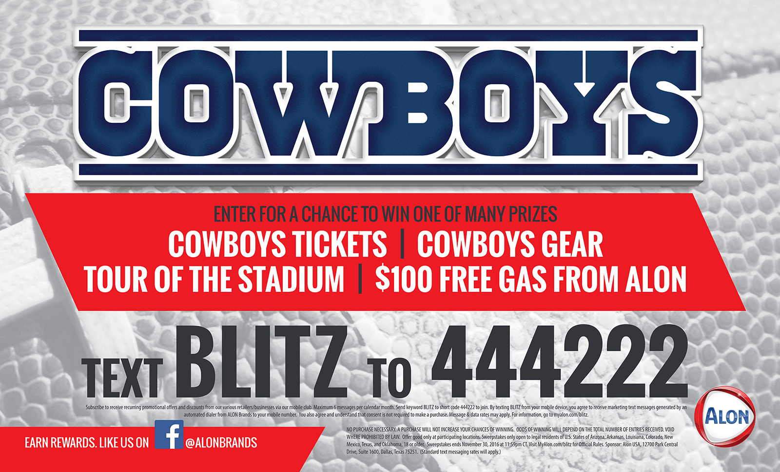
Alon convenience stores partner with the Dallas Cowboys for promotional events to engage customers, build brand awareness, and drive store visits and sales. These events often include exciting activities like autograph sessions with Cowboys players, prize giveaways, tailgate parties, and watch parties for away games. It’s a win-win for both the stores and the fans, creating memorable experiences and fostering customer loyalty
KEY ELEMENTS:
Typography
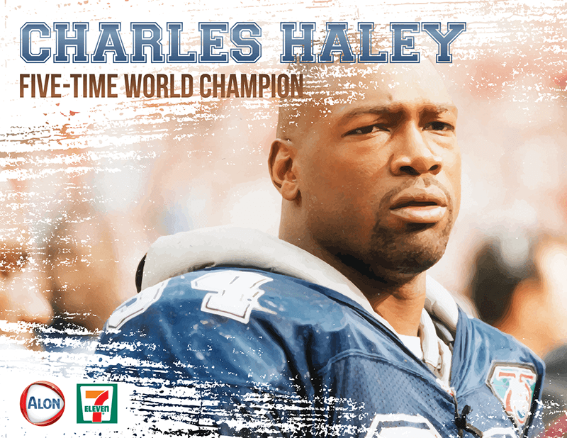
The typography used in these flyers is bold and prominent, ensuring that key text stands out. The word “COWBOYS” is featured in a large, bold font, making it the focal point. The names of the players, “JAY NOVACEK” and “CHARLES HALEY,” are also in large, bold fonts, emphasizing their significance. Supporting text such as “THREE-TIME WORLD CHAMPION” and “FIVE-TIME WORLD CHAMPION” is in a slightly smaller, yet bold font to maintain readability while highlighting important achievements.
Layout
The layout of the flyers is well-organized with a clear hierarchy of information. The main headline is placed at the top, followed by the player’s name and their accolades. The text is strategically aligned to guide the viewer’s eye from the most important information to the supporting details. The balance between images and text is maintained, ensuring that neither element overpowers the other.
Visuals
High-quality images of the players in action add a dynamic and engaging element to the flyers. The players’ images are placed prominently, making them the focal point. A textured, grunge background effect adds depth and interest to the overall design, enhancing the visual appeal.
Consistency
The flyers maintain a consistent design theme, with similar typography, layout, and visual elements across all three designs. This consistency creates a cohesive look and feel for the promotional materials, reinforcing the brand identity of the Dallas Cowboys and Alon.
Content
The flyers’ content includes key information about the promotional events, such as opportunities to win Cowboys tickets, gear, and stadium tours. The text “TEXT BLITZ TO 444222” provides a clear call to action for the audience. Including the players’ achievements (three-time and five-time world champions) adds credibility and excitement to the promotion.

OVERVIEW
The flyers are visually appealing and effectively communicate the key information about the promotional events. The use of bold typography, high-quality images, and a well-organized layout ensures that the flyers are both eye-catching and easy to read. Consistent design elements across all three flyers help create a strong brand identity, making the promotional materials instantly recognizable. Overall, the flyers are well-designed and successfully capture the excitement and prestige of the Dallas Cowboys and their promotional events.