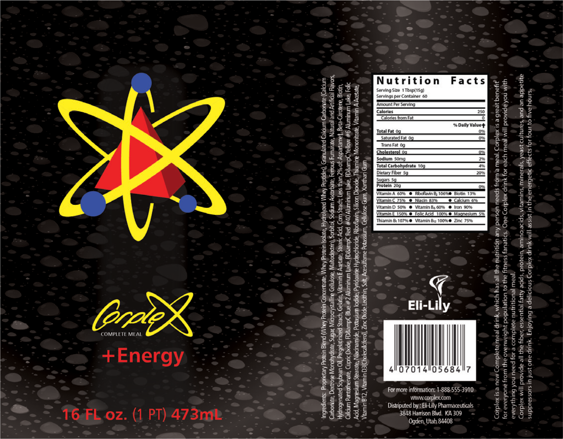
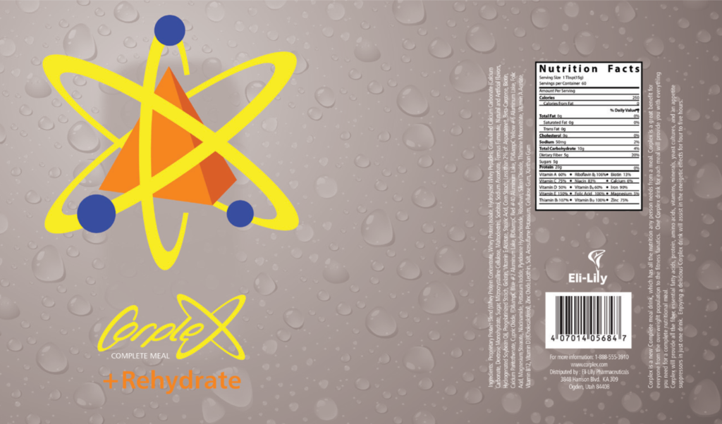
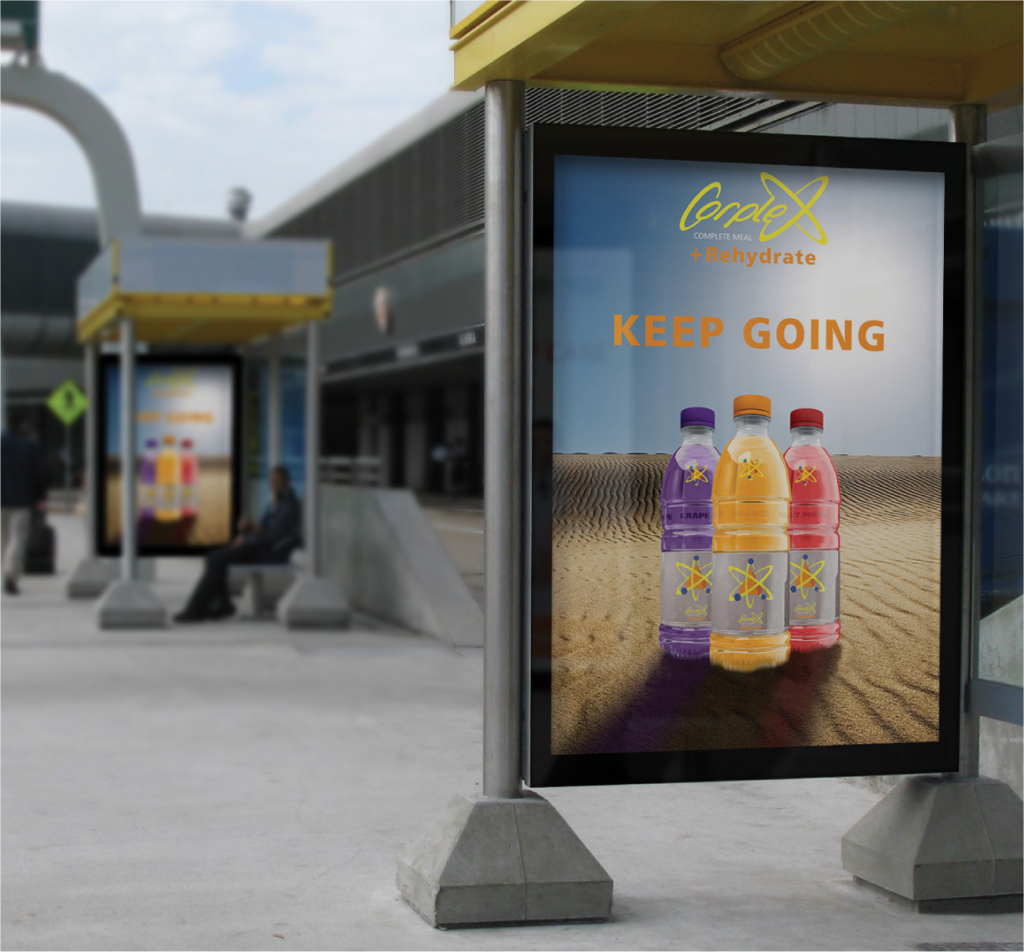
Corplex was a product design and advertising concept developed as part of a school project focused on branding a complete meal energy drink. The challenge was to create a cohesive identity across logo, packaging, and promotional materials for a beverage that delivers full-spectrum nutrition in three targeted formats: +Energy, +Rehydrate, and +Vitamins. I led the creative direction, developed the logo, designed the product labels, and built mockups and ads to visualize the brand in real-world settings.
KEY ELEMENTS:
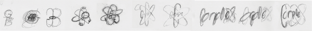
Typography
The Corplex wordmark uses a dynamic, script-style typeface that conveys motion and energy. Supporting type is bold and legible, optimized for packaging clarity and billboard impact.
Layout
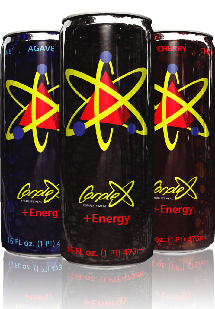
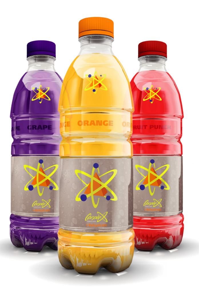
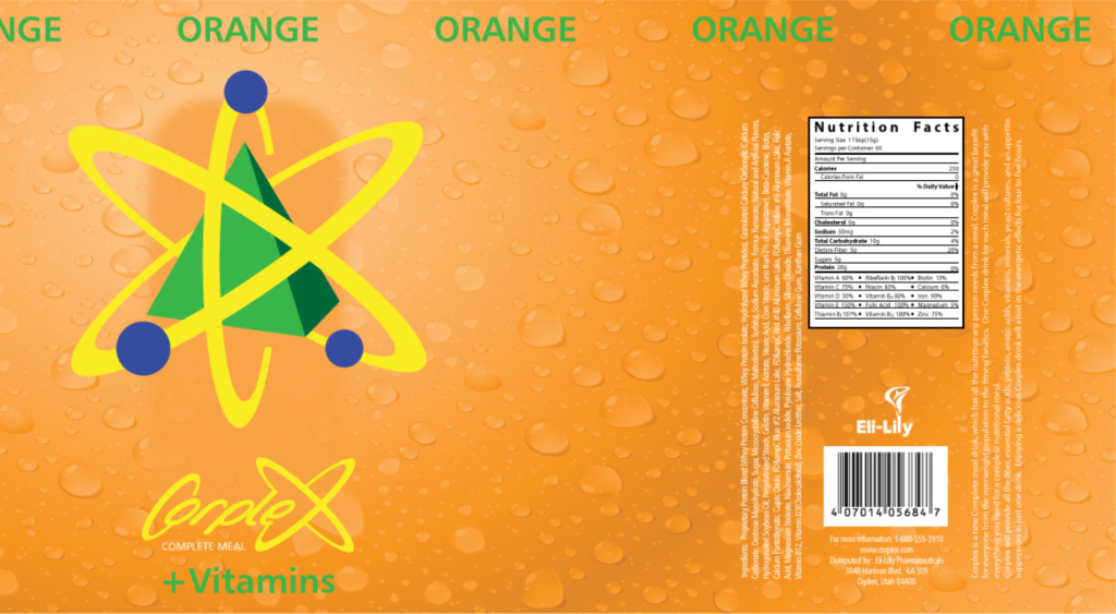
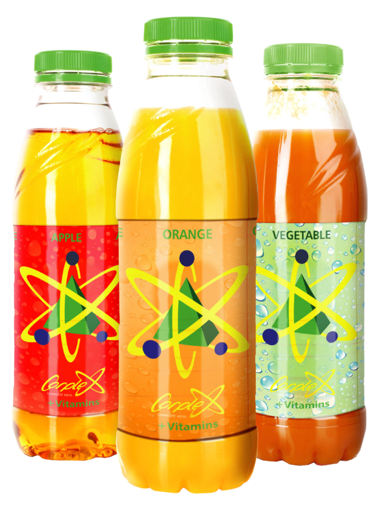
Product labels and advertisements follow a clean, modular layout that balances visual hierarchy with nutritional transparency. Each flavor variant is color-coded for quick recognition.
Visuals
The atomic-inspired logo integrates geometric orbits and spheres to symbolize balance and completeness. Vibrant color palettes and flavor imagery reinforce the drink’s energizing and refreshing qualities.
Consistency
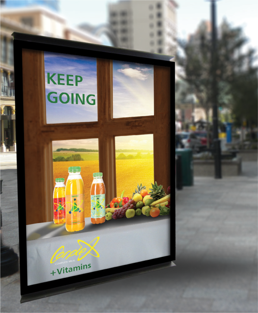
Across cans, bottles, and outdoor ads, the brand maintains a unified voice—“KEEP GOING”, anchored by the Corplex logo and its +Energy/+Rehydrate/+Vitamins system.
Content
Messaging focuses on empowerment and convenience, positioning Corplex as the go-to solution for travelers, athletes, and busy professionals seeking full-meal nutrition on the move.
OVERVIEW
This project showcases my ability to build a brand from the ground up, starting with conceptual identity and extending through packaging, advertising, and environmental mockups. Corplex reflects a strategic blend of visual storytelling, product positioning, and design execution. It’s a bold, energetic concept that demonstrates how thoughtful design can elevate a product’s promise and presence.