Holbrook Realty is a real estate agency based in Bountiful, Utah. They offer a range of real estate services, including buying and selling properties. The agency is known for its dedication to helping clients achieve their real estate goals with a personalized approach. Holbrook Realty emphasizes providing top-notch advice and support throughout the real estate proces
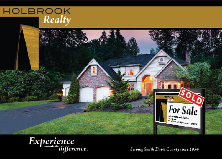
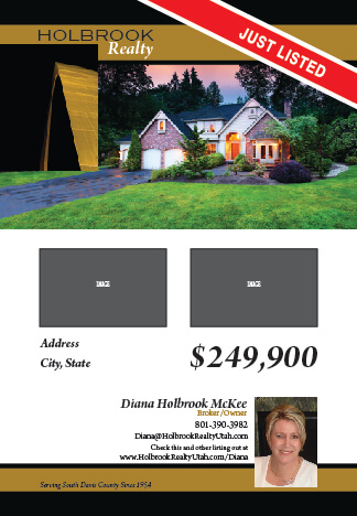
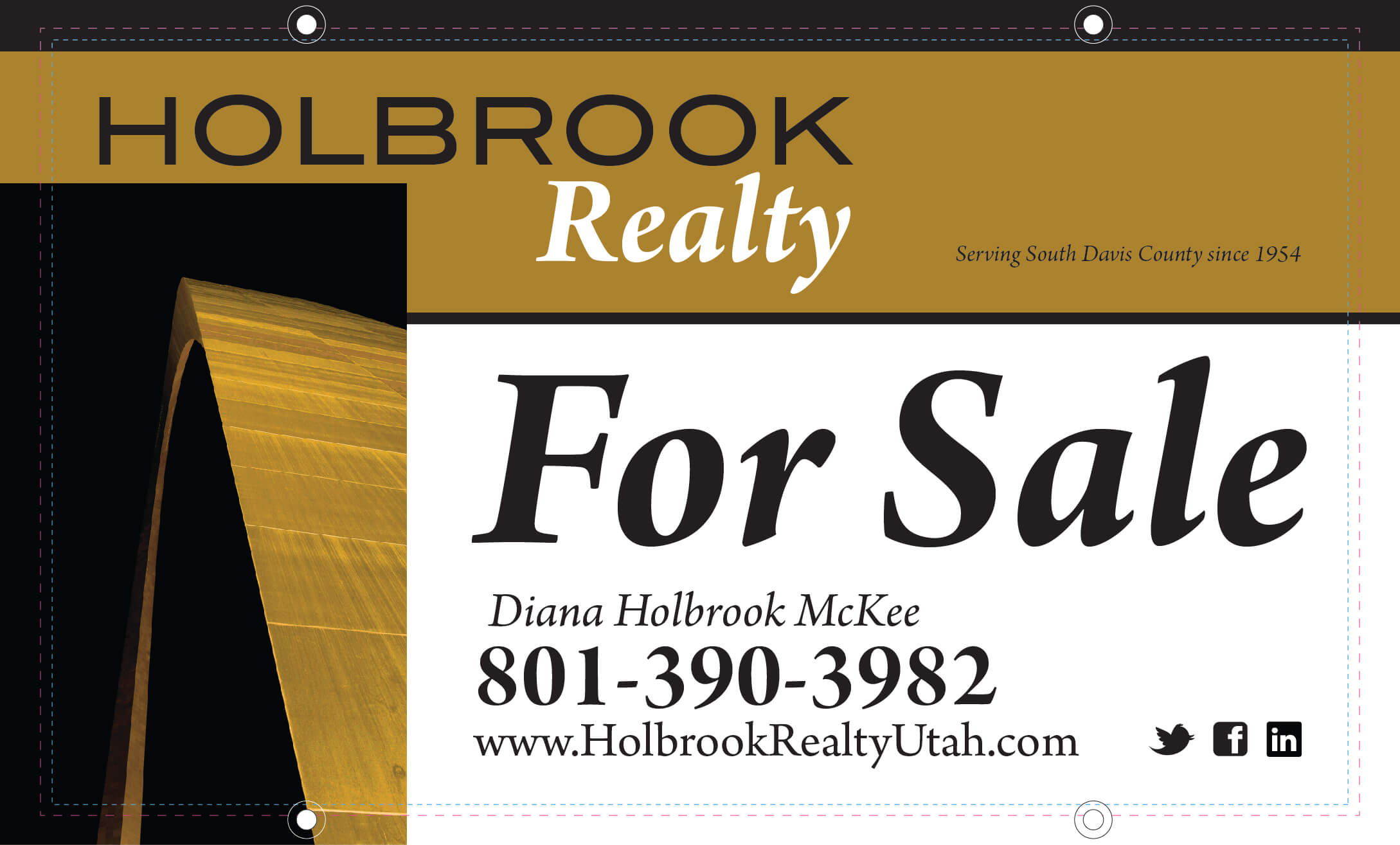
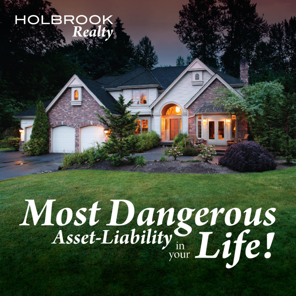
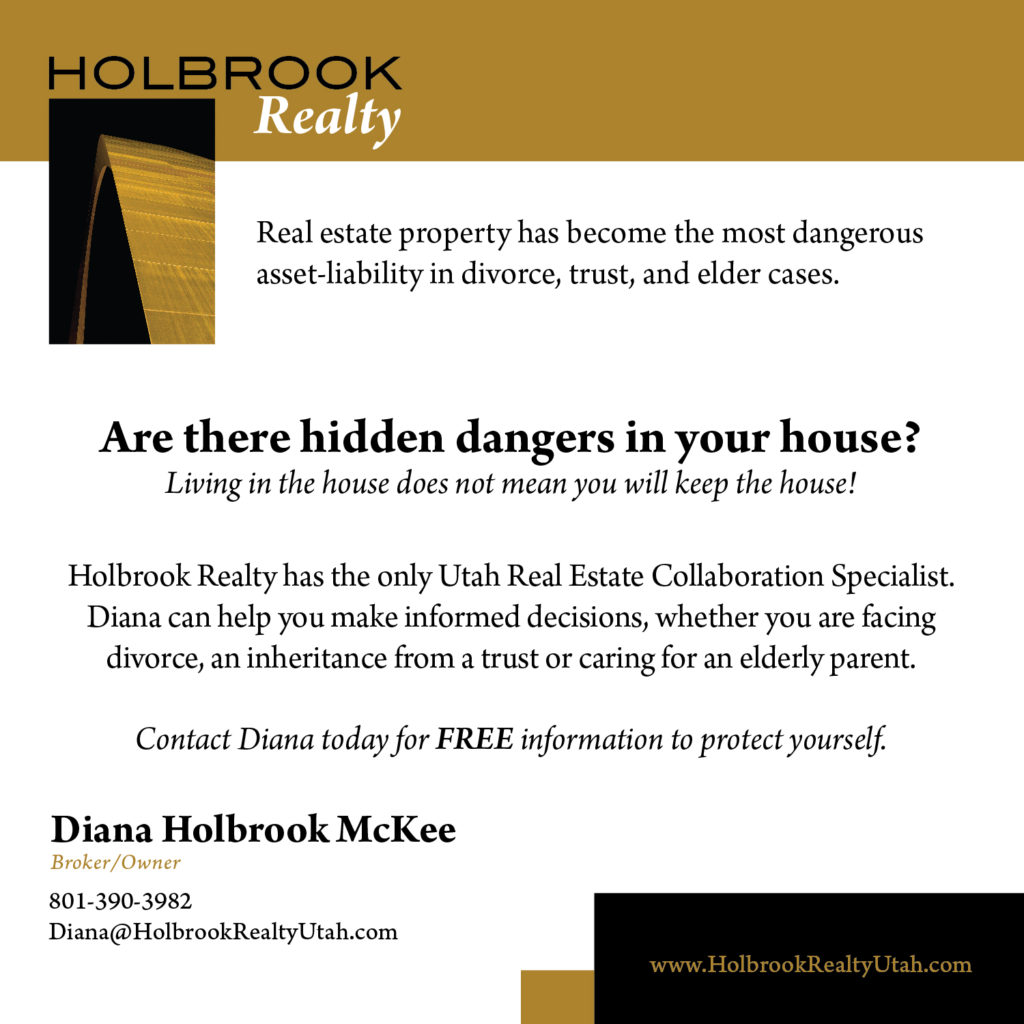
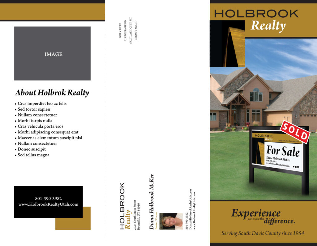
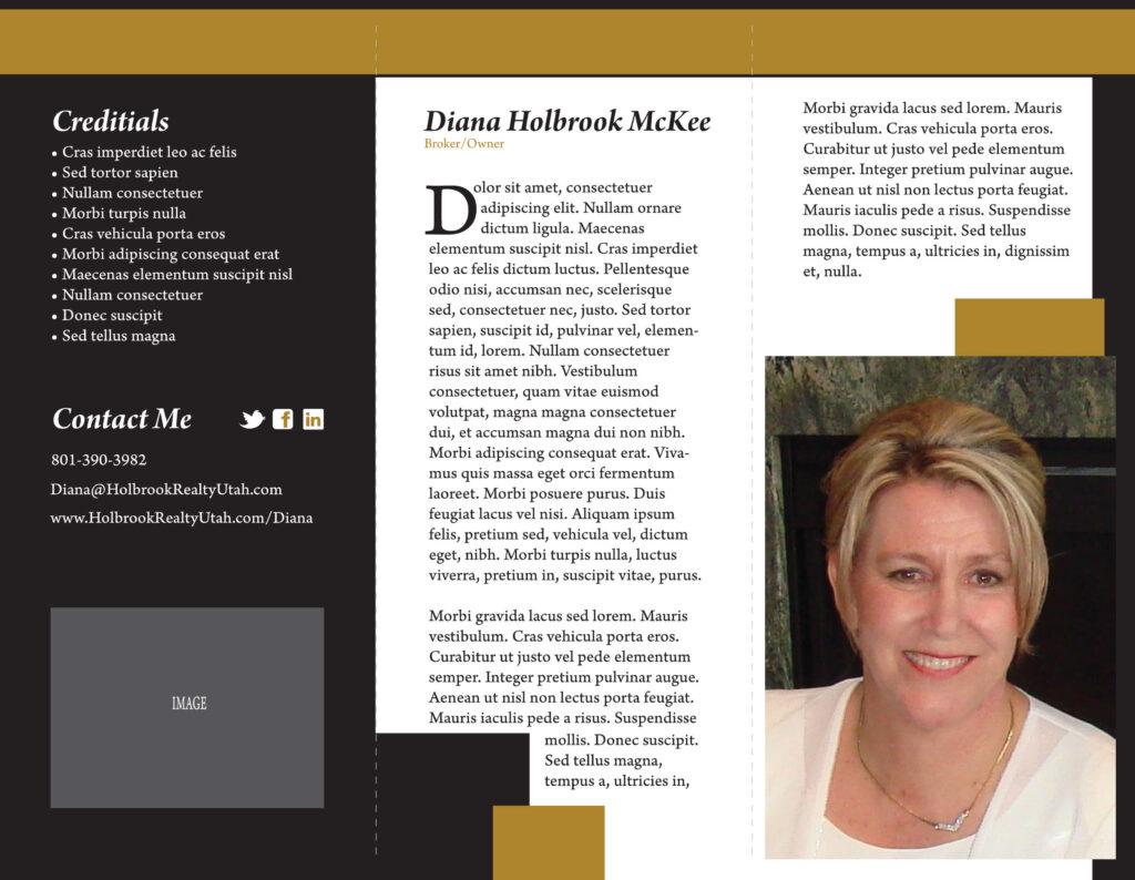
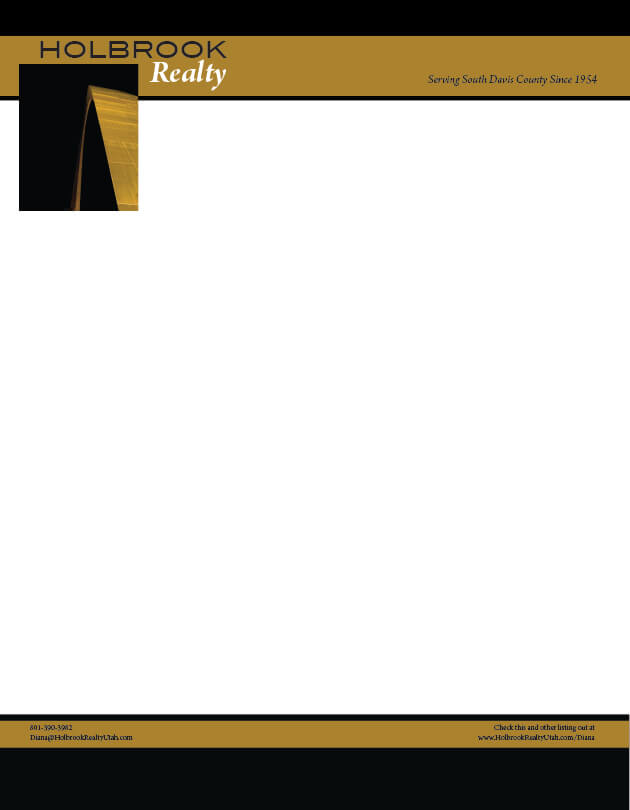
Holbrook Realty has been one of Nitch’s esteemed clients, and we’ve had the pleasure of creating a diverse range of print projects for them. Our work included designing professional handout cards, informative brochures, elegant letterhead, striking business cards, and attention-grabbing yard signs. Each project was meticulously crafted to enhance Holbrook Realty’s brand presence and effectively communicate their services to potential clients.
KEY ELEMENTS:
Typography
The typography used in the designs is clean and modern, with a mix of serif and sans-serif fonts. The headings are bold and prominent, making them easy to read and ensuring that key information stands out. The body text is legible and well-spaced, providing a comfortable reading experience.
Layout
The layout of the materials is well-structured, with a clear hierarchy of information. Each piece of marketing material has a distinct layout that guides the reader’s eye through the content in a logical and intuitive manner. The use of white space is effective, preventing the designs from feeling cluttered and allowing the content to breathe.
Visuals
High-quality images of properties are prominently featured in the designs, showcasing the real estate offerings of Holbrook Realty. The visuals are vibrant and engaging, capturing the attention of potential clients. The use of images also helps to create an emotional connection with the audience, making the materials more impactful.
Consistency
There is a strong sense of consistency across all the marketing materials. The color scheme, typography, and overall design style are uniform, creating a cohesive brand identity. This consistency helps to reinforce the brand and makes the materials easily recognizable as part of the Holbrook Realty brand.
Content
The content is clear and concise, effectively communicating the key messages of Holbrook Realty. The handouts and brochures provide valuable information about the services offered, while the yard sign and letterhead reinforce the brand presence. The use of bullet points and short paragraphs makes the content easy to digest, ensuring that the key points are quickly understood by the reader.
OVERVIEW
The marketing materials for Holbrook Realty are designed to create a strong and consistent brand presence. The use of high-quality visuals, clear typography, and a cohesive color scheme ensures that the materials are both professional and visually appealing. The content is well-organized and effectively communicates the key messages of the real estate services offered by Holbrook Realty.