RUBICON: eLECTRICAL
PROJECT TYPE
handouts
TOOLS
illustrator, Photoshop
ROLE
Designer
yEAR
2024
Rubicon Contracting is known for providing reliable and comprehensive facility management services to simplify property maintenance. They offer services such as snow removal, landscaping, pest control, janitorial services, and more. Their goal is to eliminate the need for multiple service providers by offering a one-stop solution for facility maintenance. This approach helps businesses manage their properties efficiently and within budget.
Rubicon firmly values the personal touch in client interactions. Whether connecting with existing clients or reaching out to potential ones, the company believes in leaving a lasting impression through tangible materials. With this in mind, Rubicon continues to produce exceptional printed pieces that not only captivate visually but also deliver a remarkable tactile experience. These high-quality materials, enhanced by a luxurious soft-touch finish, create a memorable and professional impression that resonates far beyond the initial interaction.
KEY ELEMENTS:
Typography
The typography in these handouts is bold and professional, ensuring that key information stands out. The use of headings with large, bold fonts catches the reader’s attention effectively. Supporting body text is rendered in a smaller but highly legible font, providing a clear hierarchy. This thoughtful approach to typography guides the reader seamlessly through the content.
Layout
The layout is clean, structured, and balanced. The sections are neatly organized, with sufficient white space to avoid visual clutter. Strategic placement of text and images makes the flow intuitive, while the use of columns and distinct sections enhances readability. The alignment and spacing showcase a meticulous attention to detail.
Visuals
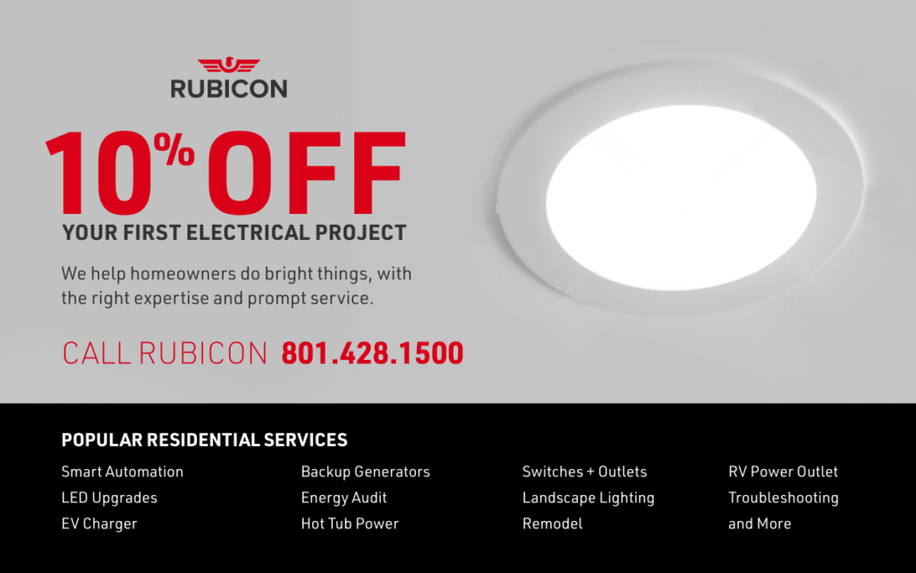
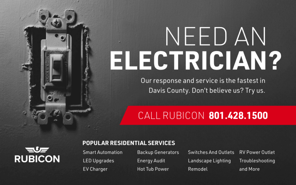
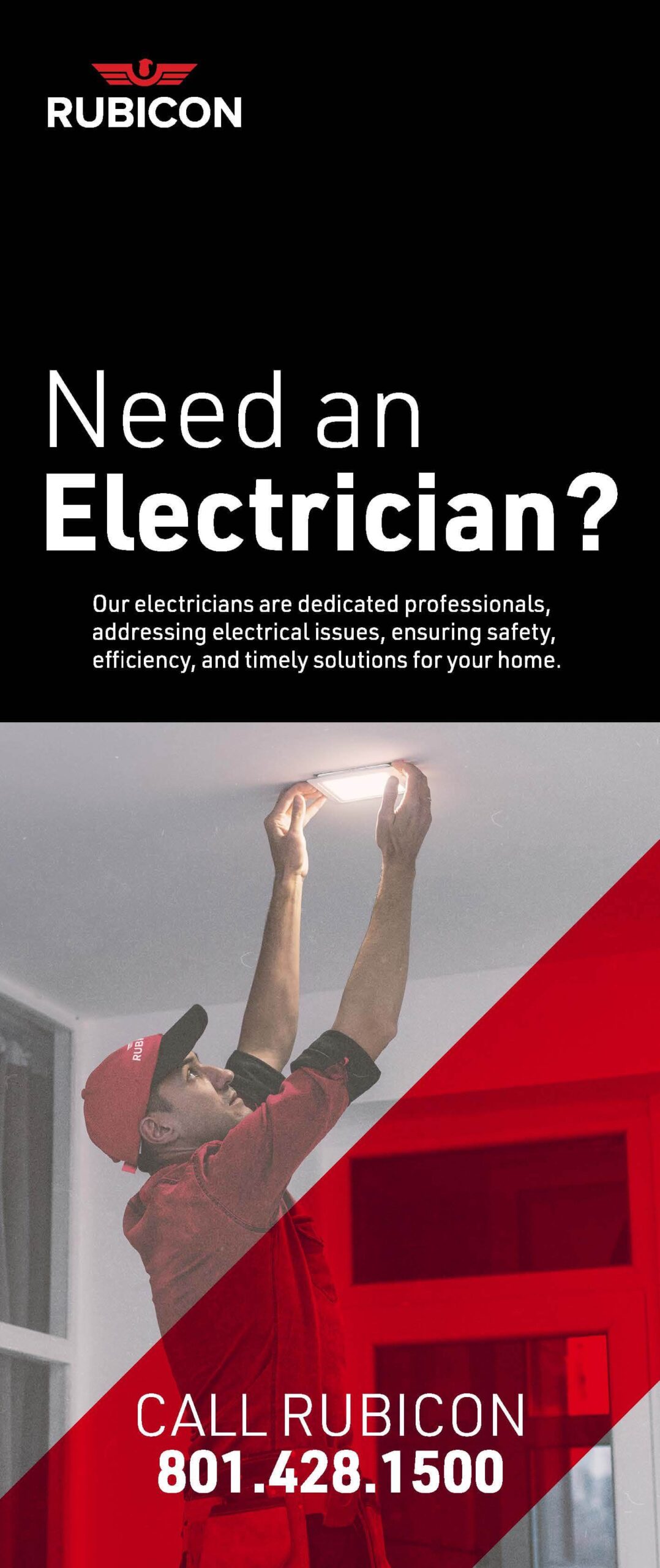
The visuals incorporate high-quality images relevant to Rubicon’s services, such as light installations, EV/RV plug setups, and LED upgrades. These images are not just aesthetically appealing but also play a key role in communicating the brand’s offerings visually. The choice of visuals adds credibility and professionalism to the overall design.
Consistency
The handouts maintain a consistent color palette and branding throughout, reinforcing Rubicon’s visual identity. From the logo placement to the repeated use of the company’s signature colors, every element works in harmony, creating a cohesive and polished look. The repetition of design motifs fosters recognition and trust.
Content
The content is precise and informative, succinctly detailing Rubicon’s array of services, including smart automation, LED upgrades, backup generators, and more. The text is tailored to engage and inform potential clients without overwhelming them. It strikes a perfect balance between technical detail and customer-focused messaging.
OVERVIEW
The Rubicon handouts are a testament to effective and professional design. The synergy between bold typography, a well-structured layout, engaging visuals, and consistent branding creates an impactful marketing tool. The content is not only concise but also speaks directly to the needs of potential customers. The design successfully highlights Rubicon’s expertise while maintaining an inviting and approachable tone.
With these handouts, Rubicon can confidently showcase its capabilities and establish a strong presence in the competitive electrical services market. This is an outstanding piece of work that reflects your expertise and dedication to quality! Let me know if you’d like suggestions or further refinements.